Your logo visually represents your brand identity, often the first thing your customers will see.
A well-designed logo can help your business stand out, create a positive impression, and communicate your brand message effectively. But designing a logo that meets all these criteria can be a challenge.
In this article, we’ll share our top 7 tips for designing a logo that reflects your brand identity and helps your business succeed. From defining your brand values to researching your competitors’ logos, we’ll cover everything you need to know to create a logo that stands out and makes a lasting impact.
So, let’s get started!
1- Start with your brand identity

A nice and neat logo is critical to your overall brand’s message. However, your business logo is neither the first nor the most important part of branding.
Before we delve into how to design a company logo, we have to do some homework. And that homework consists in creating your brand’s identity and brand story.
We speak more in-depth in a separate article about creating a strong brand. Therefore, we will focus on the essentials in this post.
Define your mission statement.
Your brand values and mission are the foundation of your brand identity. They represent what your business stands for and what you’re trying to achieve. Before diving into logo ideas accurately representing your brand, you must define these key elements.
To define your brand values, ask yourself questions such as:
-
Why am I doing this?
-
What am I doing this for?
-
What would happen if my salon’s mission was fulfilled?
Your mission statement should be clear and concise, communicating what your business does and why it exists. It should be memorable, inspirational, and aligned with your brand values.
Once you clearly understand your brand values and mission, you can start thinking about how to visually represent them in your logo.
Why Appointible?
-
Reliable team calendar
-
Unlimited appointments
-
Client self-scheduling
-
Availability and time management
-
SMS & email reminders
-
Send effective SMS campaigns
-
Multiple business locations
-
Connect Google Calendar
-
Simple pricing, no surprises
Define your target audience.
You need to design a logo that resonates with your target audience, so it’s important to define who they are before you go about being a graphic designer for a day. Your target audience should be specific and well-defined, so you can create a logo that speaks directly to them.
To define your target audience, ask yourself questions such as:
-
What is the demographic of my target customers?
-
What are their expectations?
-
What are their interests, values, and behaviors?
-
Where do they live and work?
-
What problems do they need our business to solve?
Understanding your target customer will help you create a logo that is visually appealing and meaningful to your audience
Define your brand personality
Your brand personality is the set of human characteristics that your brand embodies. It’s the tone, style, and voice that you use to communicate with your customers. Defining your brand personality is essential for creating a logo that accurately reflects your brand identity.
For this step of the process, ask yourself questions such as:
-
What is our tone of voice like?
-
How do we want our customers to feel when interacting with our brand?
-
What adjectives best describe our brand?
-
How do we want to be perceived by our customers?
Your brand personality will influence the design process of your logo, such as color, typography, imagery, and design elements. Ensure your logo reflects your brand personality to create a cohesive brand identity.
2- Understand and build a color palette
Color play a critical role in conveying the right message to your audience. It can evoke emotions, reinforce brand identity, and help distinguish your brand from competitors. Therefore, it’s essential to choose colors that align with your brand values, target audience, and industry.
A well-thought-out color palette can also facilitate brand recognition across different platforms and media.
In other words, colors are to business logos as spices are to a chef – they add flavor and bring out the brand’s essence. And speaking of food, imagine the following brands would look like this:
![]()
I don’t know about you, but I don’t feel so excited to order MacDonald’s with these colors on their products. To pick the best colors for your new logo, we must understand why particular colors have certain effects.
Red, orange, and yellow logos (or warm colors)
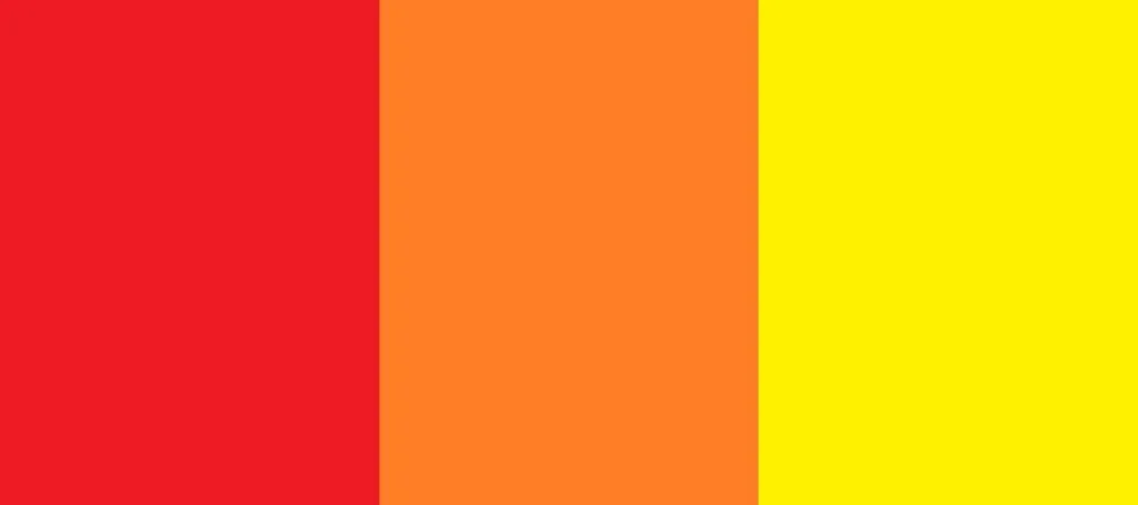
Red, orange, and yellow are often referred to as warm colors. They are considered high-arousal colors that stimulate the senses, create a sense of urgency, and increase excitement.
These colors are commonly used by companies that want to convey a sense of energy, enthusiasm, and optimism. Some examples of brands that use warm colors in their logos include McDonald’s, KFC, and Coca-Cola.
If you are considering using a warm color in your logo, it’s important to think about the message you want to convey.
-
Red can be associated with passion, love, and danger;
-
Orange can evoke a sense of playfulness, warmth, and enthusiasm;
-
Yellow is often associated with sunshine, happiness, and optimism.
Remember that warm colors can be overwhelming if used excessively, so it’s important to strike a balance and use them strategically.
Blue, green, and purple logos (or cool colors)

Blue, green, and purple are often referred to as cool colors. They are considered low-arousal colors that can create a sense of calmness, trust, and relaxation. These colors are commonly used by companies that want to convey a sense of stability, reliability, and professionalism.
Some examples of brands that use cool colors in their logos include Facebook, Starbucks, and Yahoo.
If you are considering using a cool color in your logo, it’s important to think about the message you want to convey.
-
Blue is often associated with trust, loyalty, and wisdom;
-
Green can evoke a sense of growth, harmony, and nature;
-
Purple is often associated with luxury, creativity, and royalty.
Black and white logos

Black and white are classic and timeless color choices for logos. They are often associated with sophistication, elegance, and simplicity. Companies commonly use these colors to convey a sense of authority, power, and simplicity.
Some examples of brands that use black and white in their logos include Nike and Chanel. Apple logo could also fit in this category. However, it is often seen in different colors – which is one added benefit of sometimes using black and white logos as your base color palette.
If you are considering using black and white in your logo, it’s important to think about the message you want to convey. Black can be associated with power, sophistication, and elegance, while white can evoke a sense of simplicity, purity, and cleanliness.
Logos that mix color temperatures
Some logos combine warm and cool colors to create a dynamic, eye-catching design. One example that does this well is the FedEx logo, which combines purple and orange to create a sense of energy and reliability.

When mixing colors, it’s important to consider the message you want to convey and the emotions you want to evoke. Experiment with different color combinations to find the one that best represents your brand.
3- A good logo is a simple logo
Simplicity is the key to building a great logo. If you were to take just one of these seven best logo design tips, it would have to be this one.
The internet is full of examples of bad logo designs, and most of the time, they make it to these lists because they make things too complicated.
This is how you get a logo that is simple and still speaks to your brand’s personality:
Avoid complicated shapes
Certain companies bet on complexity to create a logo that inspires a unique brand identity design. And while some succeed, logos with complicated shapes are best avoided, even if you can rely on a professional designer to create a good logo design.
Let’s illustrate this with an example:
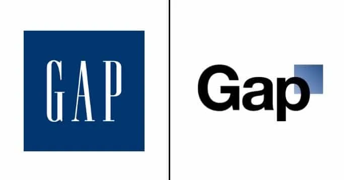
From its creation to 2010, Gap redesigned its tried, tested, and memorable logo. Their new one (on the right) featured a blue square with a smaller, white square inside of it, with the word “Gap” written in a lowercase, sans-serif font beside it:
The problem with this logo was that the blue square featured a gradient effect, which made it difficult to print and reproduce in different sizes. Additionally, the shape of the blue square was somewhat awkward and didn’t translate well to other branding materials. This caused a lot of backlash from consumers, and Gap returned to its original logo in a matter of days.
Limit the number of colors
Limiting the number of colors used in your logo is another way to keep it simple. The more colors you use, the more complicated your logo can become. Too many colors can make your logo difficult to reproduce across various mediums.
Generally, it’s best to stick to one or two colors in your logo design. This approach will help you create an easily recognizable logo that can be reproduced effectively in print and digital media.
Use negative space
Negative space is the area surrounding an object in an image. It can be used cleverly in logo design to create visual interest and a sense of depth. Using negative space in your logo design can help you achieve a simple, effective design that looks professional and memorable.
One great example of negative space in logo design is the logo for the World Wildlife Fund (WWF):
![]()
The logo features an image of a panda, with the negative space cleverly forming the shape of the world. The use of negative space not only makes the logo visually interesting but also conveys the message of the organization – that it is working to protect the world’s wildlife.
4- Get your typography right
When it comes to designing a logo, typography can make or break the final result. The font you choose will help convey your brand personality and create a memorable image in the minds of your customers. Here are some tips to help you get your typography right:
Types of font
There are four main categories of fonts to choose from:
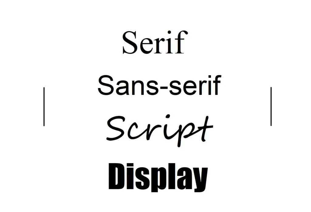
Serif fonts have small lines or flourishes at the end of each letter, which can give them a more traditional or elegant feel. Some examples of serif fonts are Times New Roman, Georgia, and Baskerville.
Sans-serif fonts are clean and simple and work well for modern brands. Helvetica, Arial, and Futura are types of sans-serif fonts.
Script fonts mimic handwriting and can give a more personal or playful feel. Check Brush Script, Edwardian Script, and Lucida Calligraphy for inspiration.
Display fonts are highly decorative and work well for attention-grabbing headlines but should be used sparingly in logos. Impact, Cooper Black, and Lobster are examples of display fonts.
Choose a font that reflects your brand personality.
When selecting a font for your logo, it’s important to choose one that reflects your brand personality.
If you run a law firm or financial institution, you may want to choose a more traditional serif font to convey professionalism and trustworthiness.
If you run a creative agency or fashion brand, you may want to choose a more modern sans-serif font to convey creativity and innovation.
Consider custom typography
Custom typography is a unique font created specifically for your brand. This can give your logo a one-of-a-kind look and help you stand out from competitors.
Building custom typography is something usually done by bigger companies, where every branding effort counts. If you have the budget – and the will – you can check with professional graphic designers or even a marketing agency, to create custom typography for your logo design.
Limit the typography
When it comes to typography in your logo, less is often more. Choosing one or two fonts that complement each other well can help keep your logo design clean and simple. Avoid using too many fonts or fonts that clash with each other, as this can make your logo look cluttered and unprofessional.
Additionally, consider the size and spacing of the typography in your logo. Make sure that the text is legible and easy to read, even when it’s scaled down to a smaller size. Keeping the typography simple and clean will help your logo stand out and make it more memorable.
5- Decide whether to include an image or not
![]()
One of the biggest decisions you’ll need to make when designing your logo is whether or not to include an image. The coca-cola logo appears only with text, while Apple incorporates a graphic element. Making the right choice can make the logo more memorable or reinforce brand messaging.
Here are some things to consider when making this decision:
The length of your company name
If your company name is long, including an image in your logo can help to make it more memorable and visually appealing. This is because long company names can be difficult to remember and may not fit well within a logo design. By including an image, you can help to create a visual identity that is easy to remember and that will stand out from your competitors.
However, if your company name is short, you may not need an image in your logo. In this case, a simple typographic logo may be enough to create a strong visual identity.
A self-explanatory brand name
![]()
If your brand name is self-explanatory, you may not need to include an image in your logo. For example, suppose you own a bakery called “The Cake Shop”. In that case, your brand name is self-explanatory, and a simple typographic logo may be enough to create a strong visual identity.
On the other hand, if your brand name is not self-explanatory, including an image in your logo can help to communicate what your brand does or represents. For example, if you own a company that sells hiking gear, including an image of a mountain or hiking boots in your logo can help to communicate what your brand is all about.
“Action vs. description” brand elements
Consider whether your brand is more about action or description. Action-oriented brands are focused on doing something, such as Nike’s “Just Do It” slogan. Description-oriented brands, on the other hand, are focused on describing what they do, such as “The Coffee Bean & Tea Leaf.”
Twitter logo is also a great example. The “tweeting” bird invites users to do just that: tweet away.
If your brand is more action-oriented, a simple typographic logo may be enough to create a strong visual identity. However, if your brand is more description-oriented, you may want to include an image in your logo to help communicate what your brand is all about.
6- Create a scalable logo
A scalable logo is one that can be resized without losing its quality or clarity. This is particularly important as your logo will appear in different mediums and sizes, such as business cards, social media profiles, website banners, or billboards. Having a scalable logo ensures that it will remain recognizable and effective in all these situations.
Most logo-making tools (which we will cover at the end of this article) create logos that are scalable.
Test your logo at different sizes.
Once you have your logo design in a vector format, it’s time to test it at different sizes. This is important because some elements that look great in a larger size may become distorted or unclear when scaled down. Therefore, it’s important to make sure that the logo is still legible and recognizable even when it’s very small.
A good practice is to test your logo at different sizes by printing it out and displaying it on various materials, such as business cards, letterheads, and signage. Additionally, you can use software to simulate how your logo will look on digital platforms, such as social media profiles or website headers.
Make sure your logo also looks good in black and white.
![]()
Another important aspect to consider when creating a logo is whether it looks good in black and white. While color is an essential element of most logos, there may be situations where it’s not possible or desirable to use color, such as printing in grayscale or using a single-color version of your logo.
Therefore, it’s important to design your logo in a way that can be effective without relying solely on color. One way to ensure that your logo looks good in black and white is to create a high-contrast design that relies on the interplay between light and dark areas rather than color.
7- Research competitors’ logos
I placed this tip right at the end of our article on purpose. Designing logos is no easy task, so one might feel tempted to go straight at competitors’ social media and create their logo based on that.
Designing memorable logos has to start with you building your mission statement and defining your brand identity first.
However, if you have followed all the steps so far and still feel that your not getting your logo design right, then checking competition can be a great way to see other logos that work – and that doesn’t.
Analyze what works and what doesn’t in your competitor’s logos.
Start by analyzing your competitors’ logos to see what works and what doesn’t. Look for common design elements, such as color schemes and typography, and think about how you can differentiate your logo from theirs.
For example, if you’re designing a logo for a coffee shop, you might look at the logos of other coffee shops in your area. Pay attention to what design elements they use, such as coffee beans, mugs, and typography. Then, think about how you can use these elements in a unique way that sets your logo apart from the competition.
Look for ways to differentiate your logo from your competitors’ logos.
Once you’ve analyzed your competitors’ logos, it’s important to find ways to differentiate your own logo from theirs. You want your logo to stand out and be memorable while still conveying your brand’s values and personality.
Think about what makes your brand unique and different from your competitors. This could be anything from your brand’s mission and values to the products or services you offer. Use these unique elements to guide your logo design and make it stand out from the competition.
For example, if you’re designing a logo for a natural skincare brand, you might look at the logos of other skincare brands in your industry. You might notice that many of these logos use similar design elements, such as leaves and flowers. To differentiate your logo, you might focus on a unique aspect of your brand, such as the fact that all of your products are vegan and use design elements that reflect this.
Get inspiration from top companies
One way to get inspiration for your logo is to look at the logos of top companies in your industry. While you don’t want to copy these logos, you can get ideas for what works well in terms of color, typography, and overall design.
For example, if you’re designing a logo for an ice cream shop, you might look at the logos of companies like Ben & Jerry’s, Haagen-Dazs, and Magnum for inspiration. More broadly, if you want a design style for a more modern logo, check for top tech companies. If you are looking for a classic style, look for perfume brands instead.
Pay attention to the design elements they use, such as shapes, colors, and typography.
Three bonus logo design tips:
There you have it. We are almost at the end of today’s ride. We provided seven logo design tips for your to create your first logo or improve an existing one.
The perfect logo is an effective logo.
You can follow all possible design principles and logo design tips or hire a professional to design a logo for you, but at the end of the day, a perfect logo is a very subjective thing.
The right logo doesn’t have to be one that wins awards, but each target demographic, explain the type of business, and create a good first impression. Keep this in mind to avoid any perfectionistic trap.
Use a logo design tool.
There are many tools that can help you create a logo design. Canva and Logo.com are good places to start. A logo maker tool can help you create logos fast. They come packed with logo templates and other elements that can help anyone feel like mastering graphic design.
Get more business tips with Appointible.
Appointible has a ton of resources to help you improve your marketing efforts and manage a more efficient business. Take a look at our business resources for logo design tips, how to increase productivity, and more.